
Three directions for the new Rihim Pharma website.
Each design shows the hero and two sections, built with the same technology as the final website (Next.js / React). Open a design to explore it, then come back here to compare.
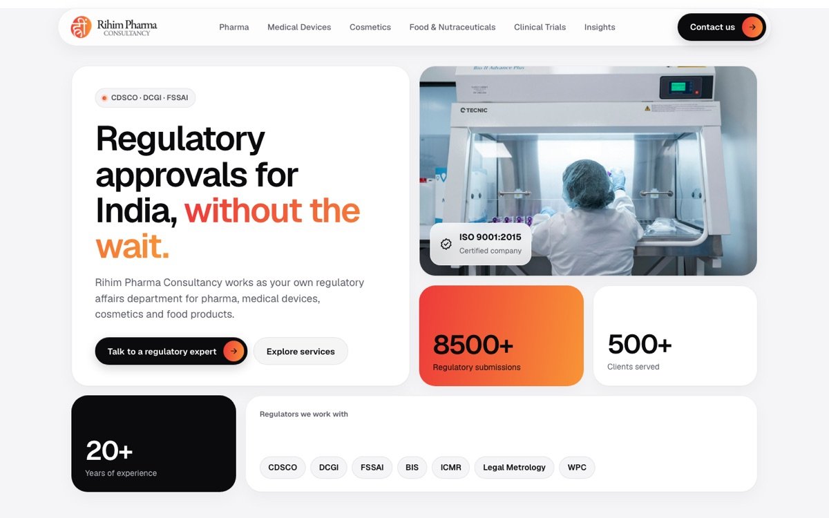 A
Bento grid
Modular tiles of different sizes, in the style of Apple and modern product sites. Clean, friendly and easy to scan.
- Floating pill menu
- Tiles for numbers and services
- Soft shadows
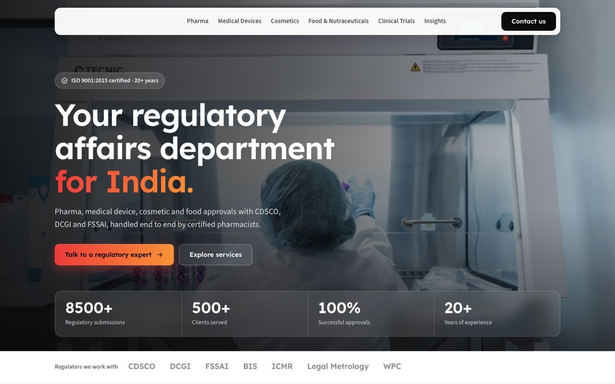 B
Photo-led corporate
A full-width laboratory photo with a strong headline. Premium corporate look that builds trust at first sight.
- Full-width photo hero
- Glass bar with key numbers
- Image service cards
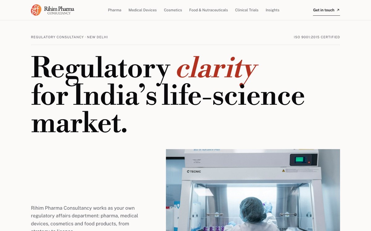 C
Minimal editorial
Large serif type and plenty of white space, like a leading journal. Calm, confident and very easy to read.
- Large serif headline
- Numbered service index
- Thin lines, quiet colour
Same content in all threeServices, numbers and contact details are taken from rihimpharma.com.
Rihim’s own coloursThe orange gradient, black and grey come from the Rihim logo.
Works on every screenEach design adapts to desktop, tablet and phone.